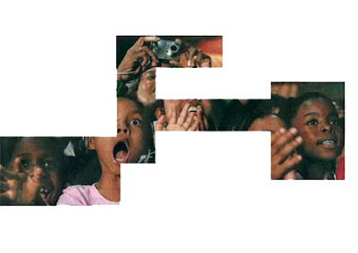
In this second session, we have been working in groups of four to design a poster obviously using letterpress. Each group had to based their work on a color and the color the group i was in had was Green. So we had to figure out a sentence related to green. Then fellow members of the group suggested 'green eggs and ham' they said it was a quote by Dr seuss. I though it was funny so the whole group merely agreed to the suggestion.We had to look for the font and size we wanted to use so, we went for helvetica standard and another one which I can't remember but I think it was gill sans. We had to print them and then cut each words as we had to place it on a grid just to work and see how the layout would be.
The image above is an example of another group work plan of their grid layout and how they are positioning the letters.Cutting the words.
End result of our layout planning.
Sunday, 29 November 2009
Wednesday, 25 November 2009
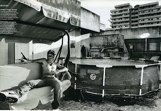
work by mark jenkins
As I was looking on at a blog website given by a friend to look at, I saw a link to someone called Mark Jenkins and the image that was beside it caught my attention so that's how I got to see this image and I got wowed by it because it is not anything that it seen every day and it also has a funny side to it. The image as been done at Royan, France.
Monday, 23 November 2009
Process (cards)
This worskshop happened during the induction weeks. We were combining two different sets of images to create a new meaning to it. The task now is to produce 100 cards with which will contain 10 different themes exploring what we have been looking at in the session and trying to understand the meaning of them and also how to apply them.It was a total shock when we were told to produce 100 cards but then it is worth it as I think it is a good practice to improve my skills on visualizing things.
Letterpress workshop
The beginning was quite brief as we have been told the basics of letterpress.
The image on the right just shows the information we have been passed on during that first session which is basically where the letters are arranged and also showing the different thicknesses 'em'.
We then got shown how the to arrange the letters which I though was quite tricky because of the ending part when we had to justify the letters which meant that the whole thing had to be tight so that the letters would not drop out.
Then we had to put it on a tray like the image below shows and use two magnets to block the letters firmly on the tray.
This is the bit where we started printing the words on paper. Just rolling it back and forward.At first I was kind of getting fed up with getting my letters tight which was not going the way I wanted it but then as they always say the end result is always the best bit which is what made me think again about how fascinating letterpress can be as the sight of it changes from what s seen on the computer. So from all that just happened for the very first session I had for letterpress, I cant wait to see what will happen next and how the outcome will come out.
Creating a personage & another workshop
What we had to do for the lesson was to create a person by inventing their character and daily life. These images are just few things the group had done for their own personage creation. we had been given the choice to choose the target audience we wanted to create. There were different composition of ideas for each target. It was really interesting to see what other people though about the different targeted group and how they would associate things with them.
Workshop 2
The second workshop consisted of applying different aspect impact that would attract the audience to look at the design work. These are the impacts, money saving, sensory, emotional, practical, aspirational, innovation and rational. We have been doing a little exercise basically showing how we can use a message and combining it to one of them impacts.
Wednesday, 11 November 2009
Self project 4 family
This is a logo I have worked on for my dad. The full logo name is graphic design services. I dont remember much about it but as far as i remember it is just a trading business.
He already had in mind an idea of what he wanted the logo to be as he did a sketch of it which was bold but I didn't like how there was no effect to it, it was just plain as if it was just a writing abbreviation in a phrase. What I did was to link the 'GDS' together and cropped the letters to form something new.
Tuesday, 10 November 2009
Term 1 Project brief for the GDF
Today was the start of the 1st term brief. There was a free option of choosing who the client was going to be, what message to send across and who the target audience were going to be.
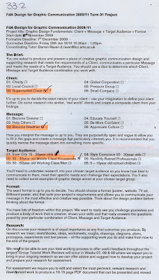
But the twist to this is that to choose the client, message and target audience, we had to throw three dices so that the numbers came out random which was quite unexpected.
The dice numbers which came out for me was three,three,two which on the paper indicated,
Client- supermarket chainMessage- become healthyTarget audience- 30 - 40year old middle class housewives
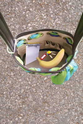
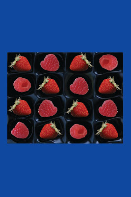
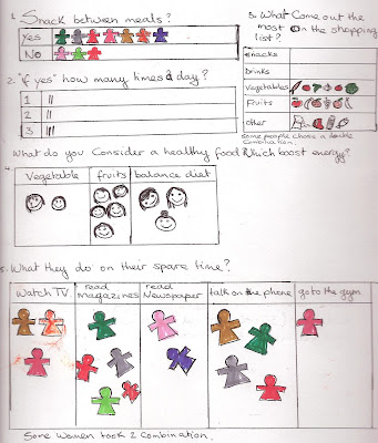
This is a little research which i did on the subject and i chose to focus on the women snack intakes since is really vital for women to stay in shape.
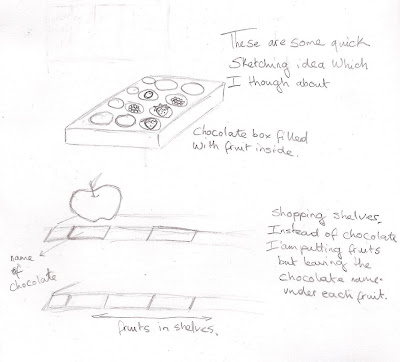
These are my ideas which i though about and illustrated them through quick sketches.
The next four images shows the possible ideas which i could have used that related to what i wanted to express.
OUTCOMES
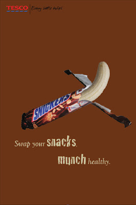
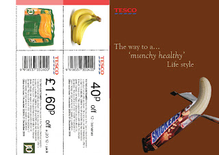
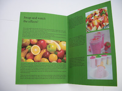
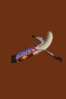
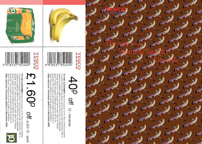
My outcomes in the end were a poster and brochure booklet.I had to go through little under changing to improve the booklet as I felt that it was too plain so, I figured doing a repetition of the message across the booklet front cover.on top previous booklet front and back cover outcome an below new improved design.
But the twist to this is that to choose the client, message and target audience, we had to throw three dices so that the numbers came out random which was quite unexpected.
The dice numbers which came out for me was three,three,two which on the paper indicated,
Client- supermarket chainMessage- become healthyTarget audience- 30 - 40year old middle class housewives
This is a little research which i did on the subject and i chose to focus on the women snack intakes since is really vital for women to stay in shape.
These are my ideas which i though about and illustrated them through quick sketches.
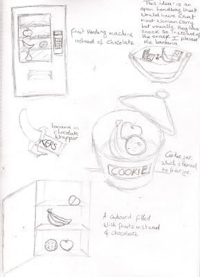
The next four images shows the possible ideas which i could have used that related to what i wanted to express.
OUTCOMES
My outcomes in the end were a poster and brochure booklet.I had to go through little under changing to improve the booklet as I felt that it was too plain so, I figured doing a repetition of the message across the booklet front cover.on top previous booklet front and back cover outcome an below new improved design.
Monday, 9 November 2009
Story telling workshop
This workshop required us to arrange objects that wouldn't be usually be found together and create a story meaning behind it.
Once again we have been asked to work in groups of two to create the stories with the objects.
I haven't got the images done with my partner yet but when i get it i will post it.
Basically my partner and I first started with using the objects that were given to us to create photo shots of a rabbit chasing after a carrot. the images are quite hilarious. Then we did a carrot in a boat(potty) in the middle of no where. After we did a video of a moving hand.The image bellow is a status that we tried doing as a group all together but did not come out as what we expected but there were some interesting objects combination.
The image above is just more of the objects the group created individually during the workshop.
END OF WORKSHOPS
I though these weeks of workshops were really needed to get us prepare for the works coming as we had time to integrate into how we can use the software application and the facilities at the university. I already had a good knowledge of using software, well at least i though it was enough and though it was pointless going to the software workshops but i still went and when i got there i founded myself learning new things i didn't know how to use or that i had never knew i could use.
Friday, 6 November 2009
book cover
I have started to read this book recently and what caught my eyes was the cover of the book.
I though the layout was simply done and not complicated. The book also had its own font that was a handwritten type and I think just that made a difference from other books fonts. I though the handwritten type was just a brilliant idea as it goes well with the theme of the title. I also liked the artwork/ imagery used on the cover because it is just created with a mixture of thin and thick line strokes and doesn’t over power the cover and it sort of balance with the type.
Monday, 2 November 2009
Typography
I firstly had to start an exercise by choosing the fonts i wanted to use (which were hoefler text roman and helvetica) for writting my name, then tracing the letters that would form my name. below is the end result of the tracing.
Even though back in college i did learn about typography, i have to admit that my mind was not completely understanding why they were so different from each other but after this session i had time to go back and have another meeting with typography again.
After I was asked to find a way to show the differences between the various typefaces, that is how I came up with the image bellow which shows different type with the letter 'C' in a capital letter. this is just a quick idea of how i wanted to show that the 'C' are not the same has they change shape not only shapes but height as well and that is an example bellow.
Research
The research workshop showed various ways into how to collect and display research. Working in a group of 2, I and my partner started thinking of possible questions we wanted to ask the group. after that we went through the questions and decided we wanted to research on which genre of music the blue afternoon group listened to and that is how we started investigating the topic.
We went around asking the group and writing what they liked but we suddenly realised that we
were missing the way we were going to present our research so, we came up with the idea of making people draw on paper what they though about when thinking of their music genres and also collected the names of the genres to not get confused.The next step we are working on now is to do a slide show showing the images collected so that it is clear for others to understand.
These are the sketches ideas we have...
Going through this activity made me realise that it is always good to go deeper into your research in order to have the right information you need for the design work and also that it doesn't have to be overly complicated as long as anyone can understand the result it's fine.
Photography
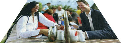
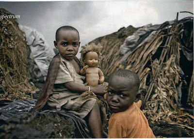
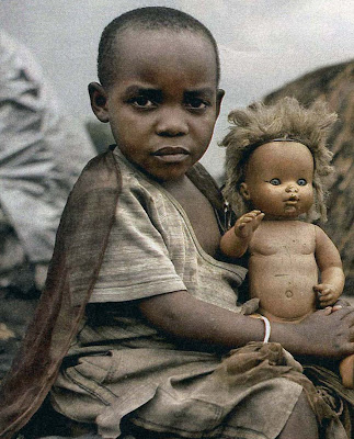
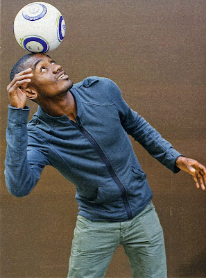
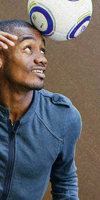
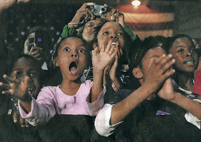
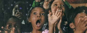
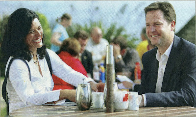
This is a little exercise done on how to crop images to give it a different meaning. The following images are what i have been working on.
Abstract
close up
depersonalize
looking distant
enhance emotional impact
discreet
crop to define
narrow vertical
bold exciting
wide angle horizontal
enhance emotional impact
discreet
crop to define
narrow vertical
bold exciting
wide angle horizontal
Abstract
close up
depersonalize
Before doing this exercise, i didn't really pay much attention to the way my images needed to be cropped which is why i though this exercise was helpful even though it was quite long to do and getting it right...i do know that some of the crops i did might not give the impact of what i wanted but i couldn't come up with anything much better.
Now i understand that even if the design is good there are crops to make it even stand out and bring others curiosity to pay attention to them.
Subscribe to:
Posts (Atom)