Looking at it again i don't think the fact that there is only one colour used ruins the book, infact i think that is what makes it stand out even more.


 I went to the visit weeks ago as part of the studio visits and the place was really nice and quiet, well a good environment to work in. The activity that we did there was not much since all we did was to ask questions about the industry and how it works for them and also whether their design was just based in the print area or multimedia.

 so from this little gift i have received from Cog Design i decided that maybe i should give it a go with writing a quick short story about london. I am really looking forward to produce it.
 When i saw this illustration cover i though it was a good piece of design because i like simple illustrations that are not too complicated. Another thing that i though when i saw this was the title which said "myths of china and japan" which is almost the similarity with the last workshop i did. It is giving me an option to think whether if i can use that bit of the workshop for my cover.
 Here i have done a combination of an eye open and closed then i just added more things as i went along; even though what i did was random, the little things i have added kept on forming new things. there also a little man in the middle and if you look though again it might look like a tear or one of them Egyptians symbols.
  I got inspired to do this image by a graphic work which i saw at the 'pick me'. I call it the flower woman. What i tried doing here is to make combining the woman and the flower as i think woman are as gentle as flowers and that's how i thought of the blooming women.
 Lastly the two opposite faces which i had fun drawing because i was thinking that it was silly but still funny to look at. What i tried doing here was two babies head, one smiling and the other sad.
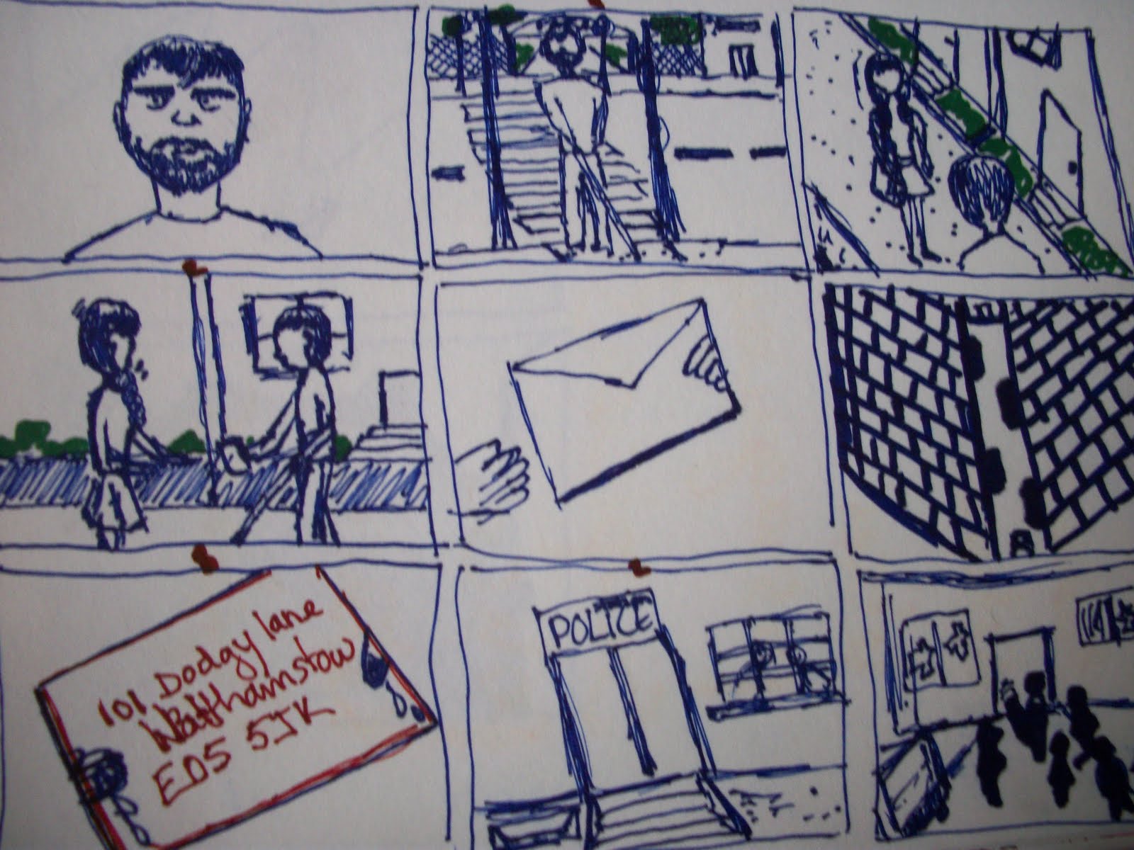
 To tell the truth when we started the frames i was not really confident into having the right information for each frames but as i went along it became fun.

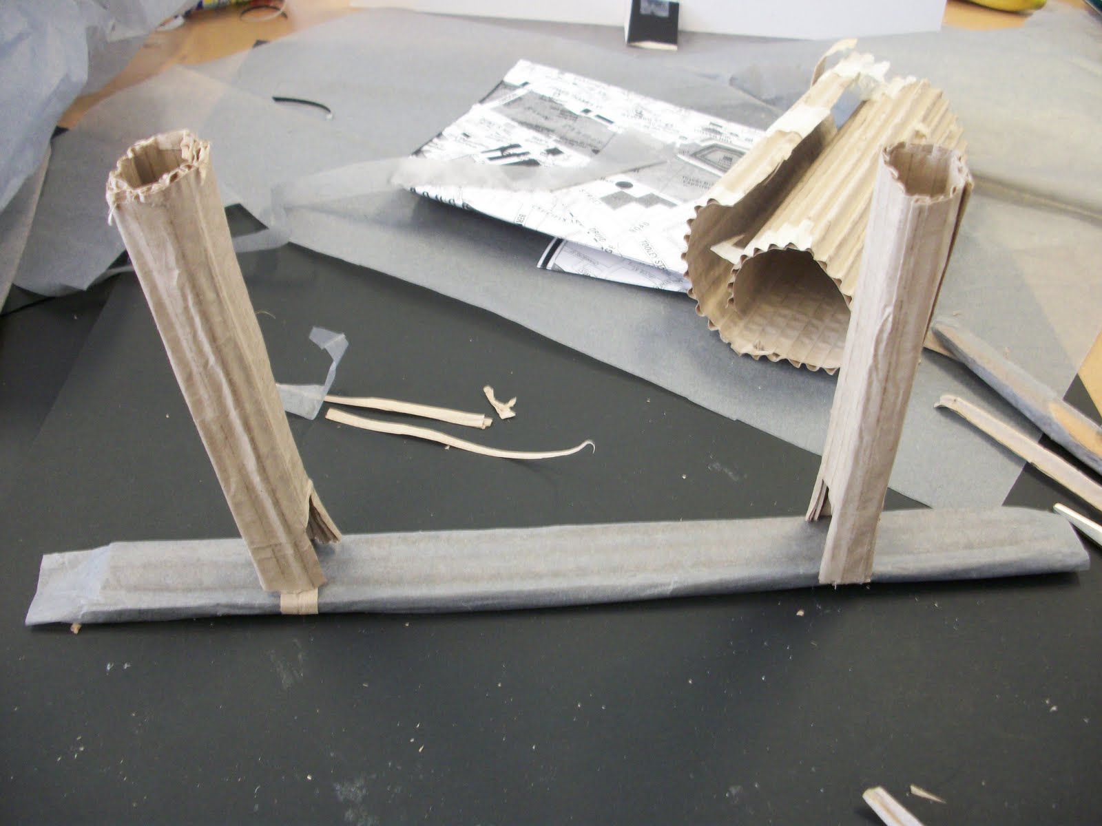 Ok... this second part of scale workshop was exciting as what we had to do was to build a 3 dimensional outcomes of a part of london (which was part of the tower bridge area) that was suggested by the tutor for that session. We obviously had to work in groups as there was to much to do for just one person. Well, the group i worked in had everyone working on different things but what we were lacking was the scale as everyone was working to a different scale.


 The outcome was really random because we focused more on the materials which made it a little appealing in a strange way but there was one other group that had managed to get everything right and the view was really effective.

 We designed an outcome for a new pen(gadget) that would be appropriate as a gift and that is how we came up with this design. we didn't want to make it to complicated or divert from the original design so we just added a part for the speakers which is on the below part of the pen and on the upward part of the pen we added a buzzer for the sound and also divided the images of which were in the pen we sill left the part of london that every tourist know but also squeezed in the bad areas of london; instead of the bus we used a little person so that wen the buzzer is pressed the little person would move to the bad side which would cause the police siren coming out from the pen.


 This is a university building not far from the british museum. The architecture of the building is a semetric and the layered rectangles forms a powerful impact when looking at the building.


 And at the end we have been asked to create an image that represent london from one of the words that we listed. So i went for london gold digger and that is what the image i created came out to be.
 It was really an interesting trip that i have made to the 'pick me up' because of all the design work i got to see and hoe they are really inspiring. Some of the design seems really simple from the view but the techniques used to produce them are complicated and a long process to do so, all of it demands a lot of patience, patience and again patience.


